Archive for the ‘ Pictures ’ Category
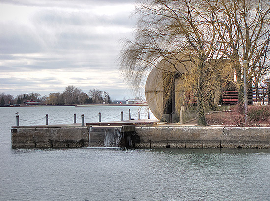
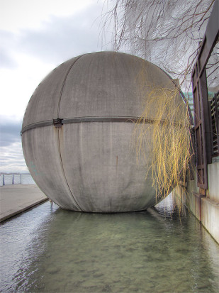
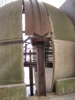
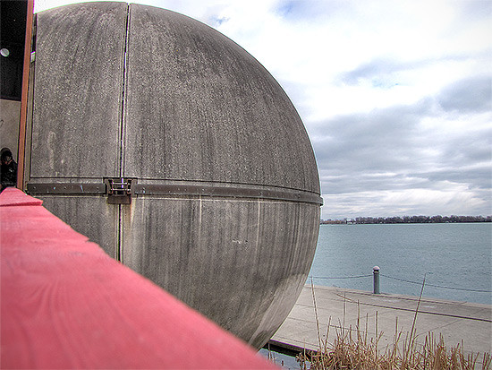
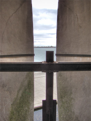
Toronto’s balls of concrete
Posted on March 23rd, 2013 – 5 Comments(I just have to find the other one)
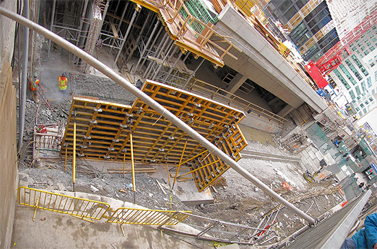
Perhaps one of TCL’s readers can tell me what this thing is? I’d guess either a fixed compass or solar clock.
It’s still cold and windy and I booked it over to warmth and coffee. On the lookout for ball #2.
Checking in again: Union Station Revitalization
Posted on March 23rd, 2013 – Comments Off on Checking in again: Union Station RevitalizationI happened to be walking around the maze of an area that’s become the front of Union Station yesterday, and it put one final question to bed that I had lingering from before. How far have they gotten?
Front Street is half closed, getting around is all weird and Escheresque, and they’re just digging out from under the street now. The main GO concourse is still 100% intact, so basically, not very far.
On the bright side, the Cinnabon is still open.
Checking in: Union Station Revitalization
Posted on March 21st, 2013 – 3 CommentsThis city project that I was blogging about as early as 2009 has always been a bit difficult for me to imagine. I mean, I knew that the areas beneath the station (where the daily commuter crunch happens), were going to be gutted and something new was going to go in, but I recently discovered some new images showing what it’s really going to look like in the end. (Yes, I did borrow these from blogTO.)
The best one is probably the basic cross-section showing how the ground beneath the trains is being transformed:
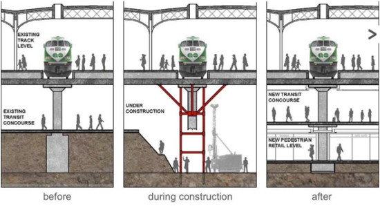
Basically, they’re splitting the lower mezzanine into two levels from the existing one.
I’m not sure how this is going to connect to the TTC and PATH, but presumably (see below), this is being done to accommodate more foot traffic, so hopefully they won’t try to jam double the people into the same entrances and exists.
The builders, NORR Architects, also provided some artist’s renderings of the upgraded station:
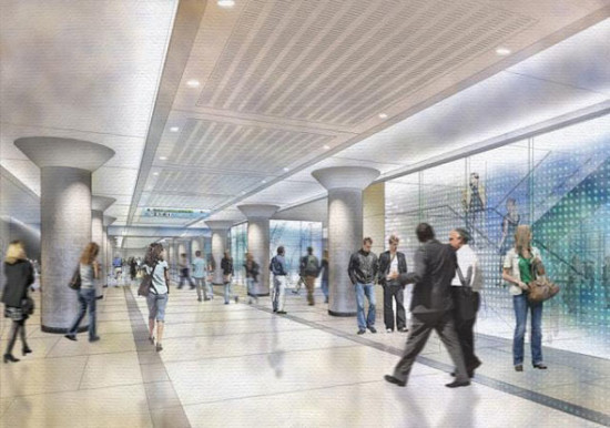
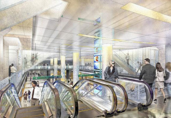
Based on the illustration above, it seems like there’s a lot of wasted vertical space. This is where my doubt (above) comes from.
Don’t get me wrong, aesthetically it’s nicer, but the fact that this is being done in a limited space beneath the trains make me wonder how efficient this will actually be. But I’m staying optimistic.
The one thing we can definitely look forward to is seeing a newly scrubbed exterior on the station, and new moat roofs over the lower-level outdoor pedestrian areas (where all the smokers hang out):
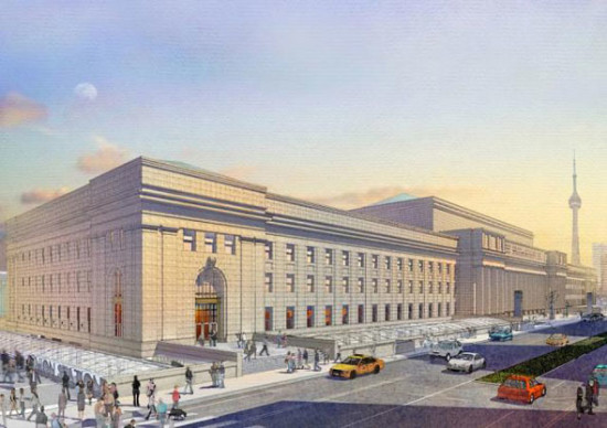
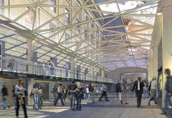
I don’t take GO, or the TTC for that matter, nearly as much as I used to. However, even when I was commuting daily (and this was many years ago), the crush was sometimes unbearable and the station just seemed horribly dated. The decor would probably have been pretty cool in the 70s, but with the wear of age and constant traffic, it was just starting to look rundown.
Personally, I look forward to seeing the newly reno’ed station — it’s an indelible slice of Toronto, and worth an occasional (but sensitive), upgrade or two.
Newer view
Posted on March 11th, 2013 – Comments Off on Newer viewDay, or night?
Rob Ford plays grab ass with Sarah Thomson
Posted on March 8th, 2013 – 1 CommentThat’s not me saying it, that’s former mayoral candidate Sarah Thomson claiming that Ford decided that this was the way to go at the CJPAC Action Party last night.
She gave extra details in a later interview, but in what way will this come as a surprise to anyone at this point?
Sarah asks, “guess where his hand was in this picture?” —
Hmmm…
New view
Posted on February 16th, 2013 – Comments Off on New viewObviously, if urbanity isn’t your cup of tea then gazing out over this every day is probably not something you’d enjoy. Sarah and I, on the other hand, are digging it (along with the prospects of a balcony garden of some sort). Spectacular sunset panoramas should present themselves forthwith…
Happy Express-Your-Love Day!
Posted on February 14th, 2013 – 1 CommentTo my dearest, most wonderful Sarah — each and every day with you is better than the one before.
I love you!
Getting around
Posted on February 11th, 2013 – 2 CommentsWith the recent dumping of snow that fell on Toronto I thought it’d be a neat idea to once again revisit the City of Toronto Archives to see how we, with all of our modern technology, fared against Torontonians of the past.
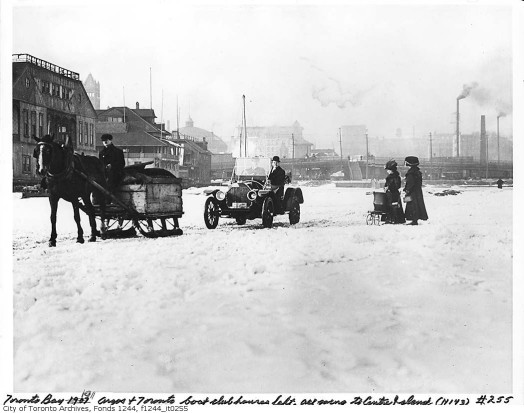
Sadly, the people of the the old Toronto dealt with the snow way better than we did. For starters, they didn’t always depend on rubber tires or internal combustion engines for getting around … check out the four-wheeled, woman-powered infant conveyance here:
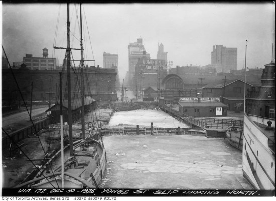
Apparently, this method of transport was so safe that no one, including the children in the drivers’ seats, gave a second thought to wandering out onto Lake Ontario in it. I suppose it was definitely safer walking on the lake during the winter than in the summer — lot fewer big ships to watch out for:
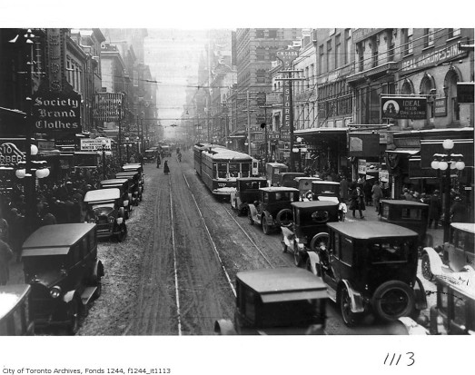
The lake also offered natural relief to traffic congestion. Road packed? …
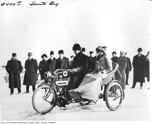
…why, just toss your best gal in the sidecar and hit the waters:
Apparently the compact “gravity-powered man car” was also quite popular, being able to go off road and being so easy to navigate that even young children could drive it. But the inability to go on level surfaces or uphill proved to be this form of transport’s undoing:
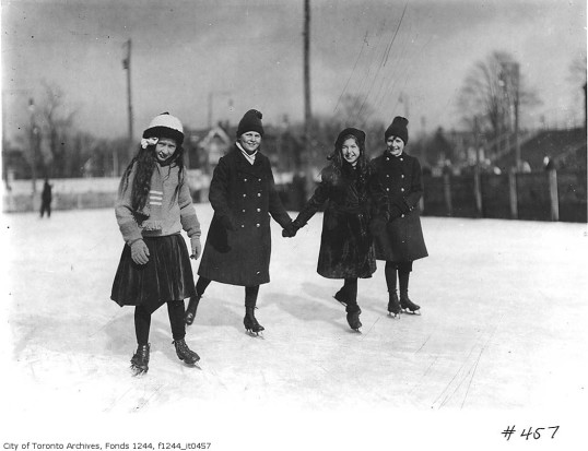
But, of course, some inventions of the era were so effective that they endured well into the modern day. Take the common “foot-car”, for example:
We can certainly learn a lost from the past, especially when modern technology fails us. Like they saying goes, don’t toss the baby out with the bathwater … unless, of course, it’s out on the lake, the safest place for newborns to be.


