Home of the frigid jerk
Posted on August 31st, 2009 – 9 CommentsA couple of weeks ago, a few Torontonians got all sorts of feminine undergarments bunched up in their crevices when they learned that Coors had mentioned Toronto in one of their ads in B.C. “Colder than most people from Toronto”, was the exact phrase.
I wouldn’t have even mentioned it because the whole thing barely warranted it. What, like thirty to forty people complained? TCL gets that many visitors in a month, easy!
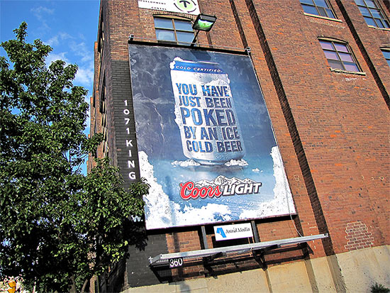
However, on my standard route this afternoon I found another one of their ads:
I read it. Then again. Then one more time.
I still don’t get it.
I mean, I like to think I’m kinda hip when it comes to this social media stuff. I may never have become a Facebook addict because I found it to be a cheap high, I never did have much use for MySpace because I already have my space, and while YouTube has been an endless source of painful (in so many ways!) hilarity, I can only digest it in twenty minutes sittings. But I digest (YES!! FINALLY GOT TO USE IT!!). I do it to stay with it. Like I said, hip. *thumbs up*
So this Coors ad … what the heck is it supposed to mean? Is it a reference to an online chat room where someone pokes you to get your attention? With a beer? I’m just not stoned enough to appreciate that, I guess.
My next thought was troubling; did someone just imply inserting a cold beer into my anus?! And what about the option for ladies?! — Hopefully that was not the message.
Could it be that someone has just physically poked you, with a beer? Does that make the beer more appealing in some way? Maybe has it touched a variety of sweaty spots during the poke and is now ringed with savoury body salts? Not with my beer, thank you kindly.
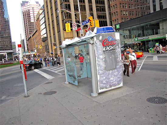
It just seems like the Coors people are having some trouble getting their message across. Look here:
So what’s so bad about this? On the surface, nothing. You have a beer that’s so cold that it’s been frozen to the bus shelter. The whole thing has, in fact, become a giant ice box. The image of a super-cooled beverage was probably intended to convey how you’d just turn to a chunk of solid ice the moment that baby hit your lips – it’s that cold.
The first problem is that it’s a lie. A visual lie, I mean. You walk into that shelter on a sweltering day and it’s not a bit cooler than it is outside. In situations like that, the “ice” becomes “condensation” from the heat, trapping the sheltered travellers in a sweltering sauna! Or at least it seems that way.
The second problem is that it’s it’s such an extreme image, all I can think of is the pain of anything ice cold hitting the back of my throat on a hot day. Some people get brain freeze, I get this; either way, I don’t want anything that cold to drink. A voice box that can be shattered with the tap of a hammer is not refreshing to me, I don’t care how many calories it has.
Finally, you got the snow on top. That’s Toronto for a good chunk of the year; summer is when most people try to forget about it.
The message was supposed to be Coors: cold and refreshing, but to me it came across as Coors: deceptive, painful, and upsetting.
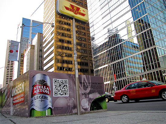
I don’t even have anything against Coors. Not a beer I care for but I’d give it a hand if it fell in the street. You know, live and let live sorta thing. Besides, other beer companies have subscribed to strange advertising ideas too. Take this Stella Artois ad, for example:
The weird square in the middle is an UpCode tag. What you’re supposed to do is to download the UpCode application to your mobile phone. When you run it, it uses your webcam (at a very low resolution) to scan the code in, like the UPC scanner at supermarkets, and it opens up the web page it reads in. An automatic, no-type web address, if you will.
If you’re bored, you can read the UpCode from the photo above (the large size works better) on your own phone; just tilt it a bit to flatten the square in your display.
Anyhow, the whole thing seems like a long diversion, doesn’t it? And what does it link to?

Hopefully they’ve fixed it by the time you’re reading this, but you’d think they’d get their act together considering the poster is, like, out there.
They could’ve used that spot in the ad for a nice-looking model doing enticing things with a beer bottle. Instead, it sports an ill-conceived brick.
I believe in the modern interweb lingo, this is called advertising FAIL. (sorry, not sure if I’m supposed to italicize that)
At least Coors got the part about Torontonians being frigid jerks right.











 Dear guy who fell at the


